From Italy to Austin: A Masterclass in Moody Sophistication
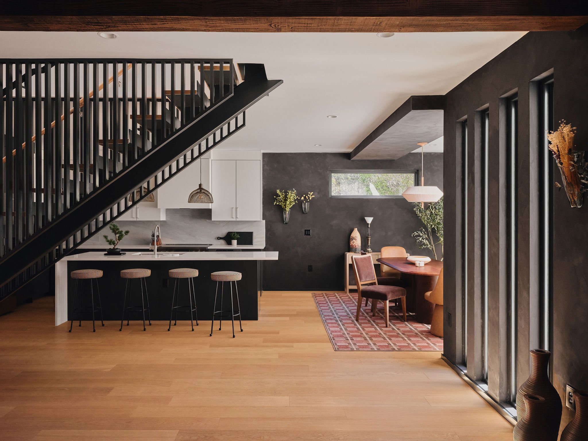
The Mount Vernon Estate is a soulful intervention in Austin’s 78745 neighborhood, transforming a high-density, multi-structure compound into a curated sanctuary of "essential beauty." Inspired by a transformative encounter with European craftsmanship, this project serves as a living testament to the power of intentional design, where historical reverence meets the understated luxury.
Photos by Jeremy Doddridge

The European
Epiphany
Timothy Stanton | Head of Brand:
I remember calling you from Italy during my honeymoon, probably sounding like a madman. I was walking through these piazzas and perusing through boutique hotels that carried an emotional sophistication we don’t often see stateside. Big bold saturated art, sculptural furniture, ornamental fixtures with so much color and pattern. Nothing felt mass-produced. No fast furniture. No soulless design.
Charles Vesley | Head of Design:
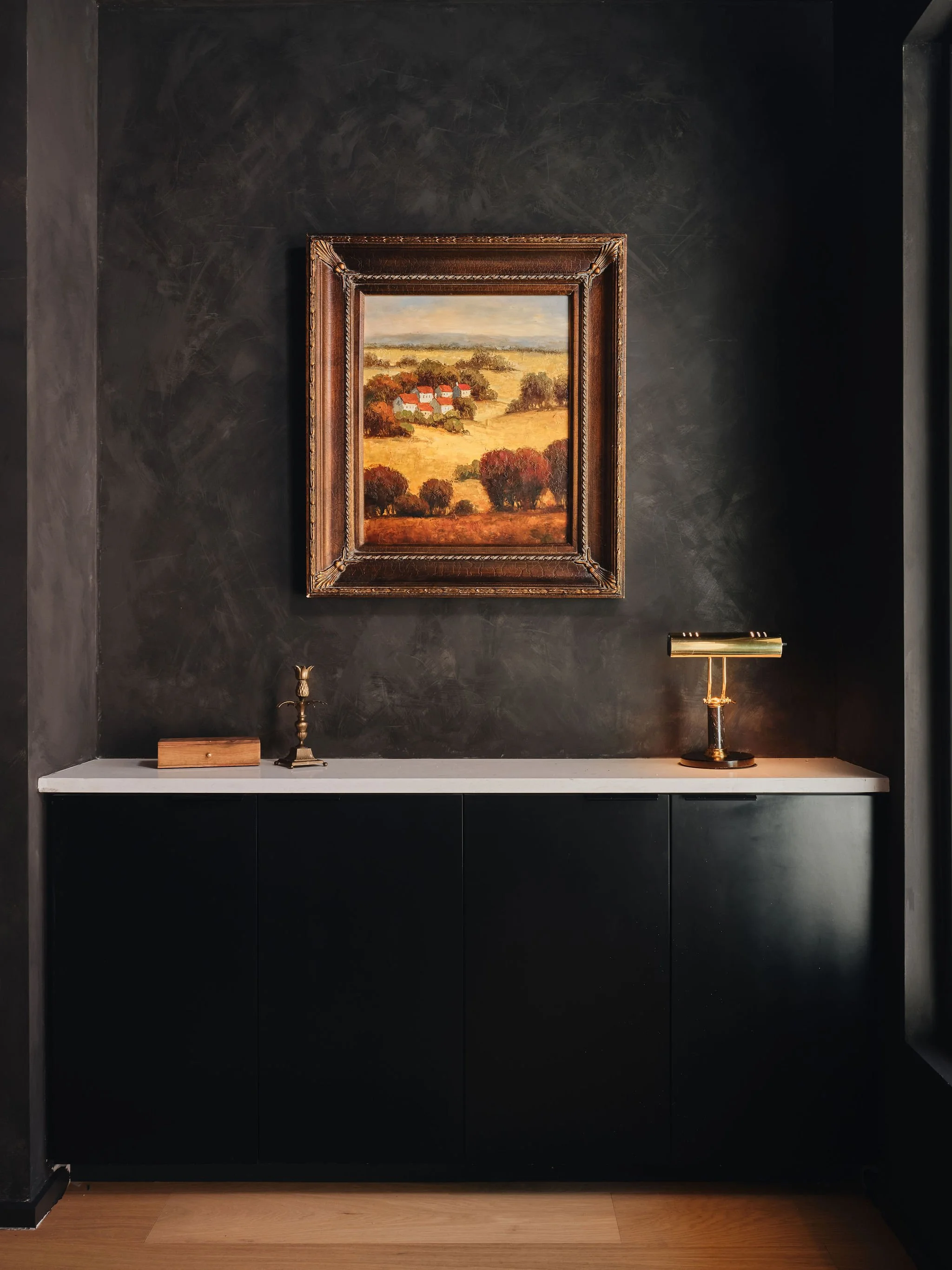
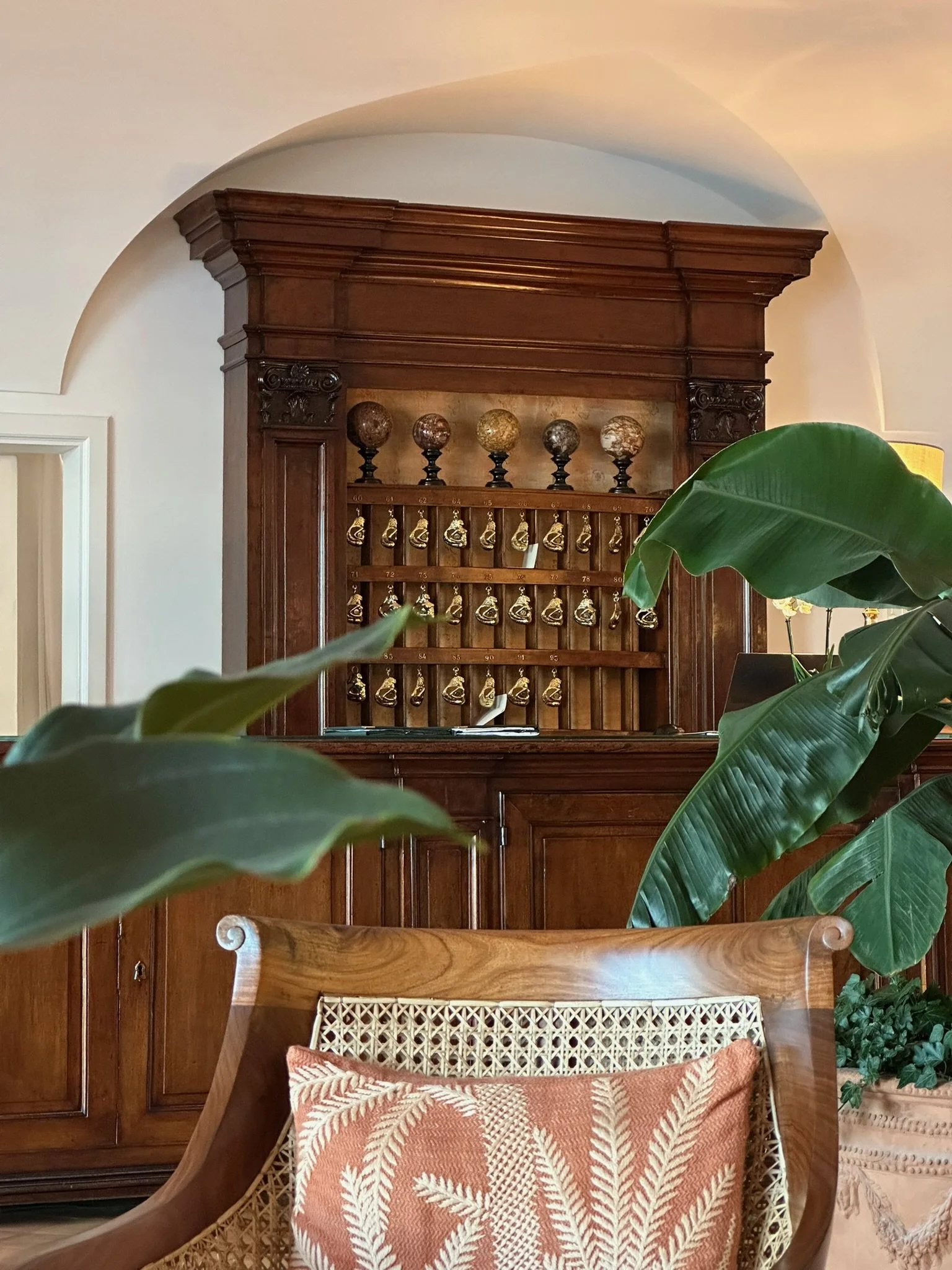
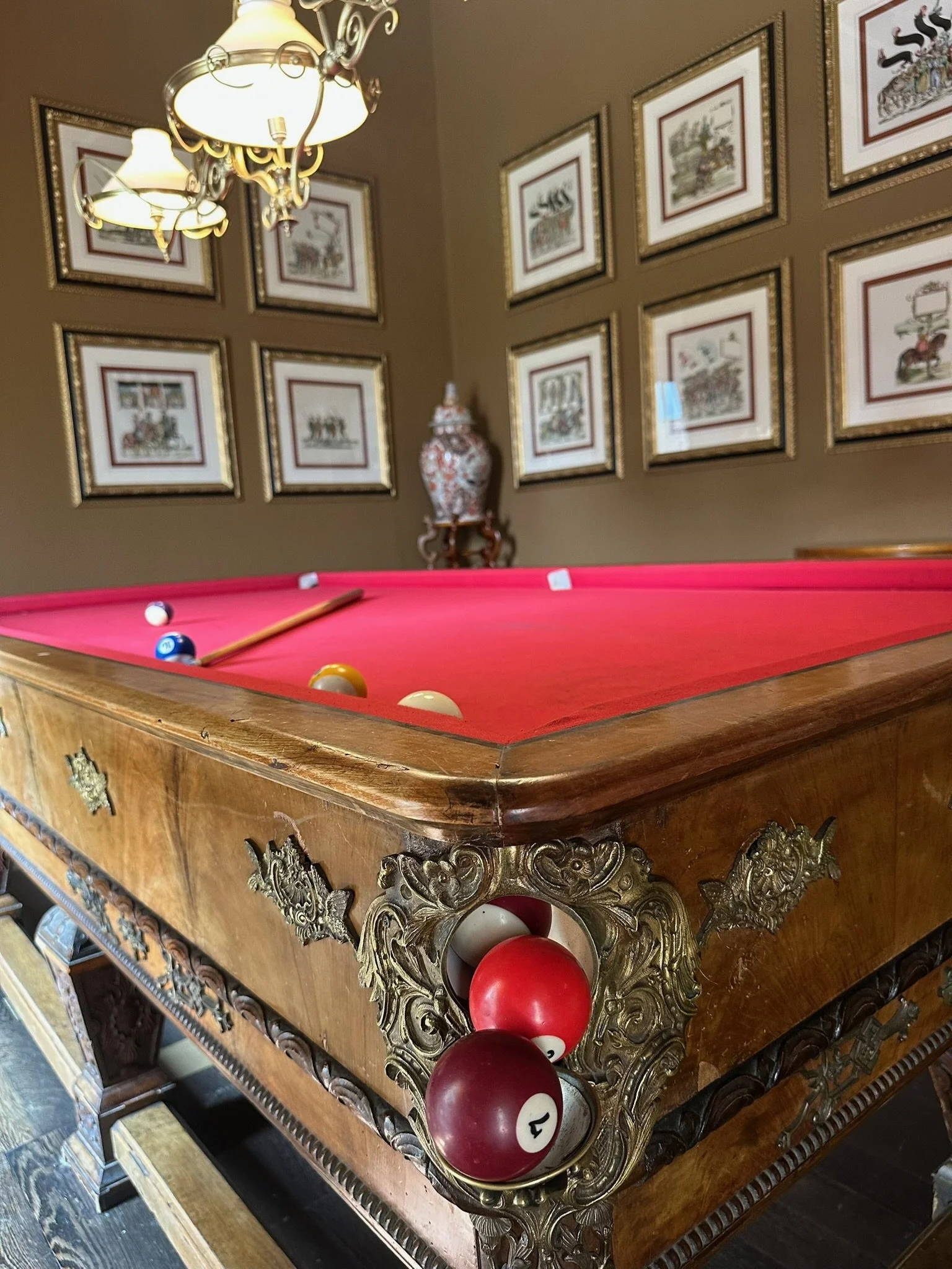
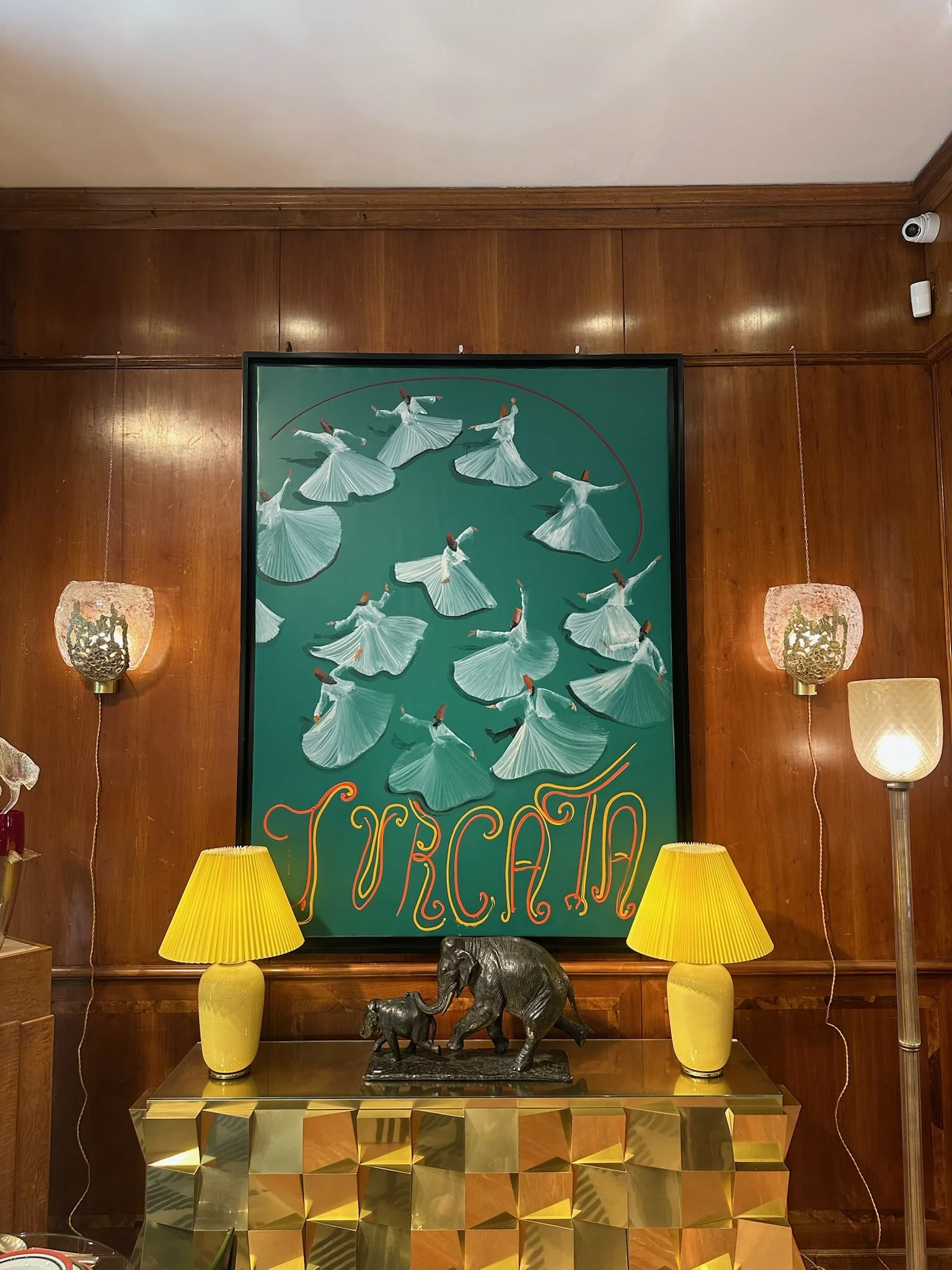
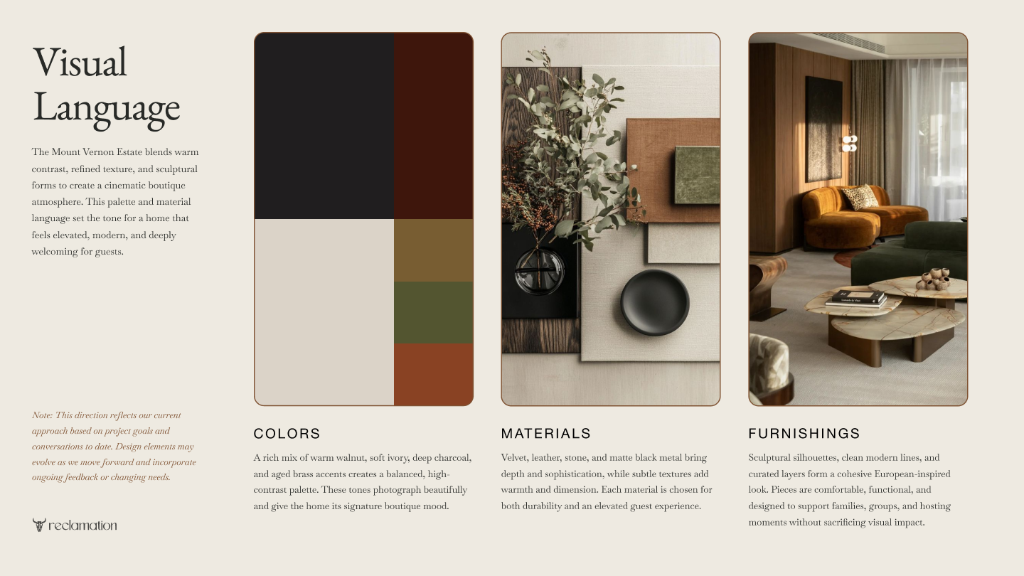
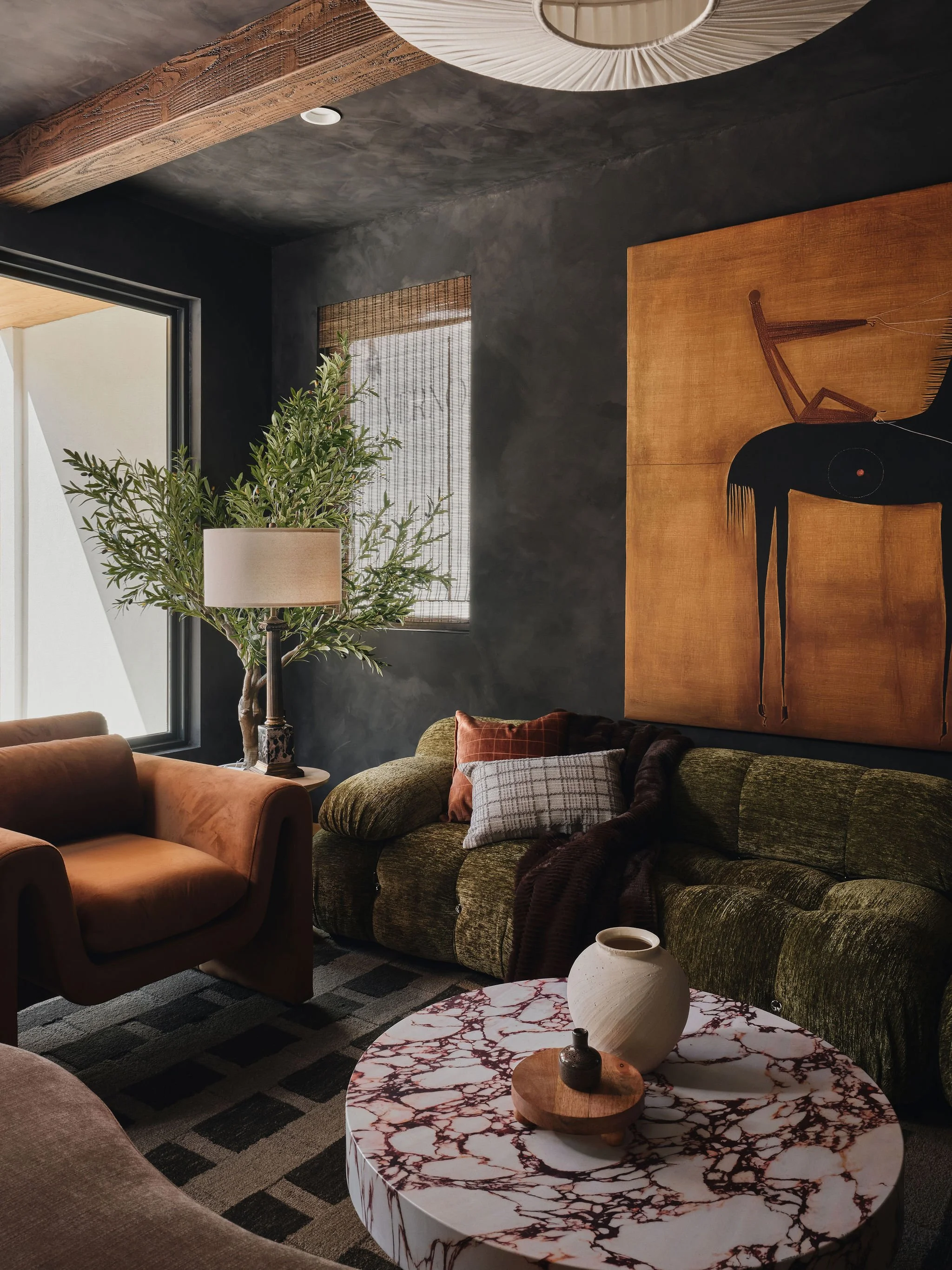
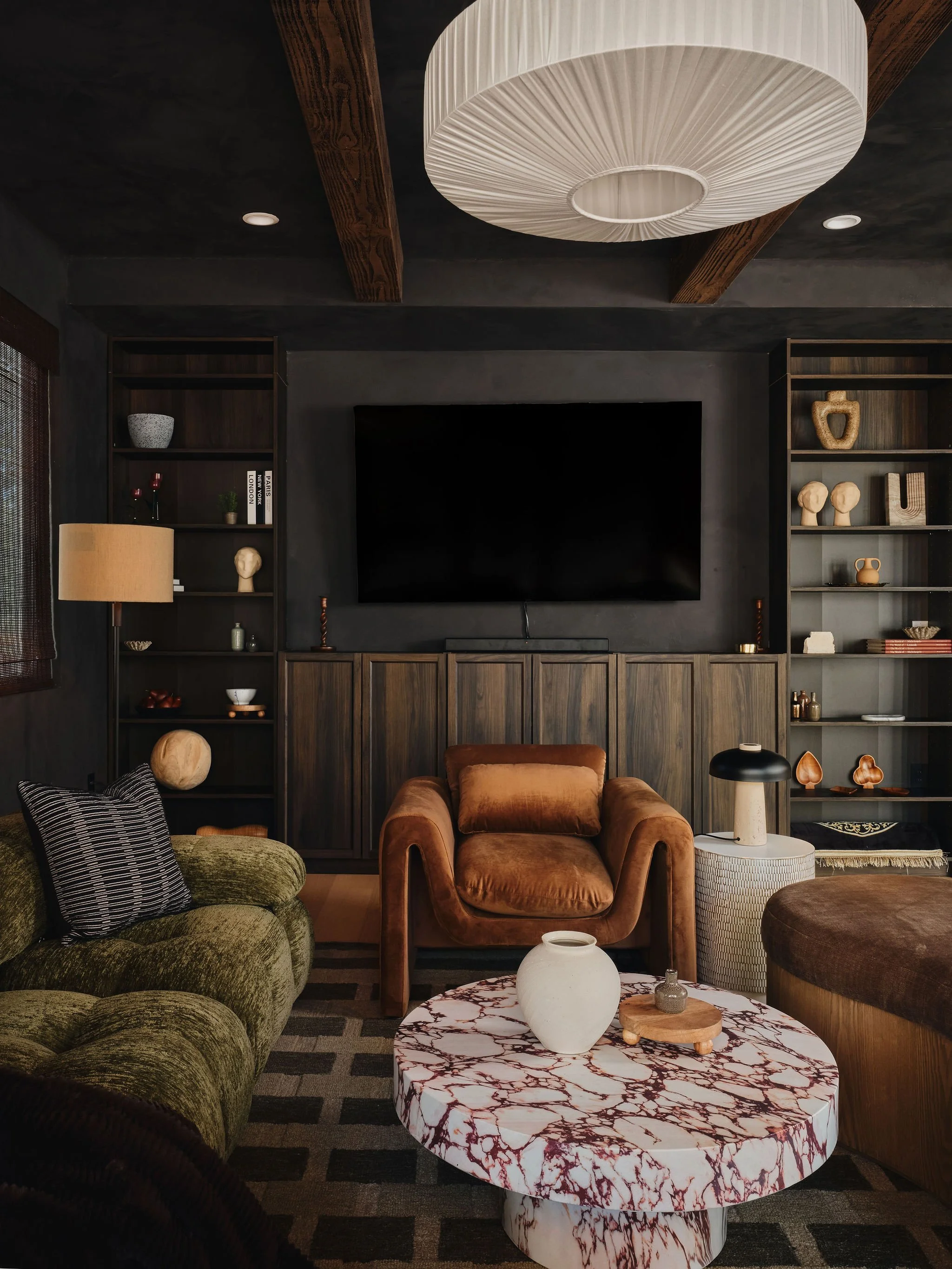
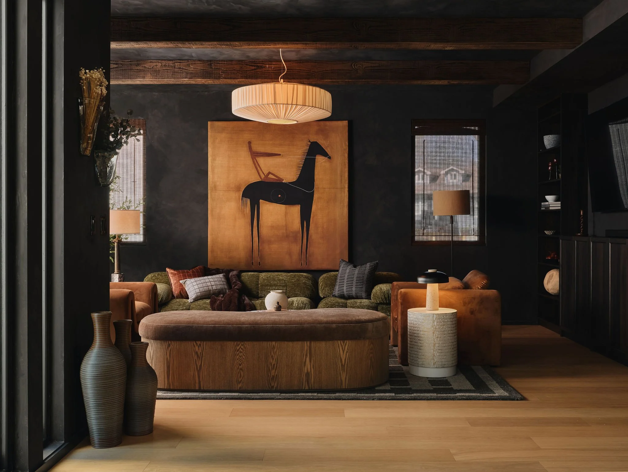
I remember that call. You were talking about "intentionality" and how the Italians cracked the code on building things that outlast trends. And I was already looking at the plans for this property and knew it had to be the canvas for that epiphany. It led me to a high contrast color palette with a rich mix of walnut, ivory, charcoal, and aged brass accents. And really anchoring to materials like velvet, leather, stone, and matte black gun metal to bring depth and sophistication.
The Window to the Brand
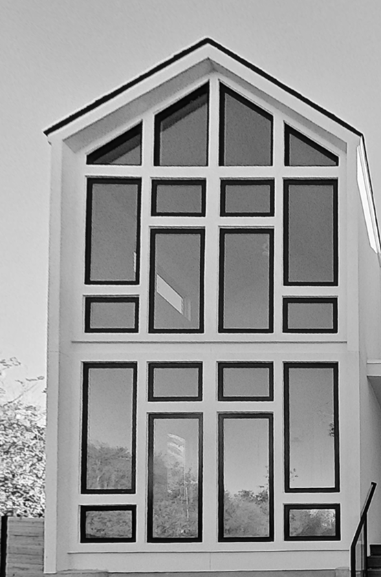
TS: The part of the design direction you created that really brought that European sensibility to life was the sculptural silhouettes you incorporated into the furnishing. I’m not going to lie though, the 70+ Cathedral-like windows across the property helped a bit too… it felt like this modern take on old-world, European bones and was so iconic that we had to build the brand around it.
CV: Those windows are so unique that it was obvious they could be translated into an iconic, refined logo mark.


A Leap of Faith
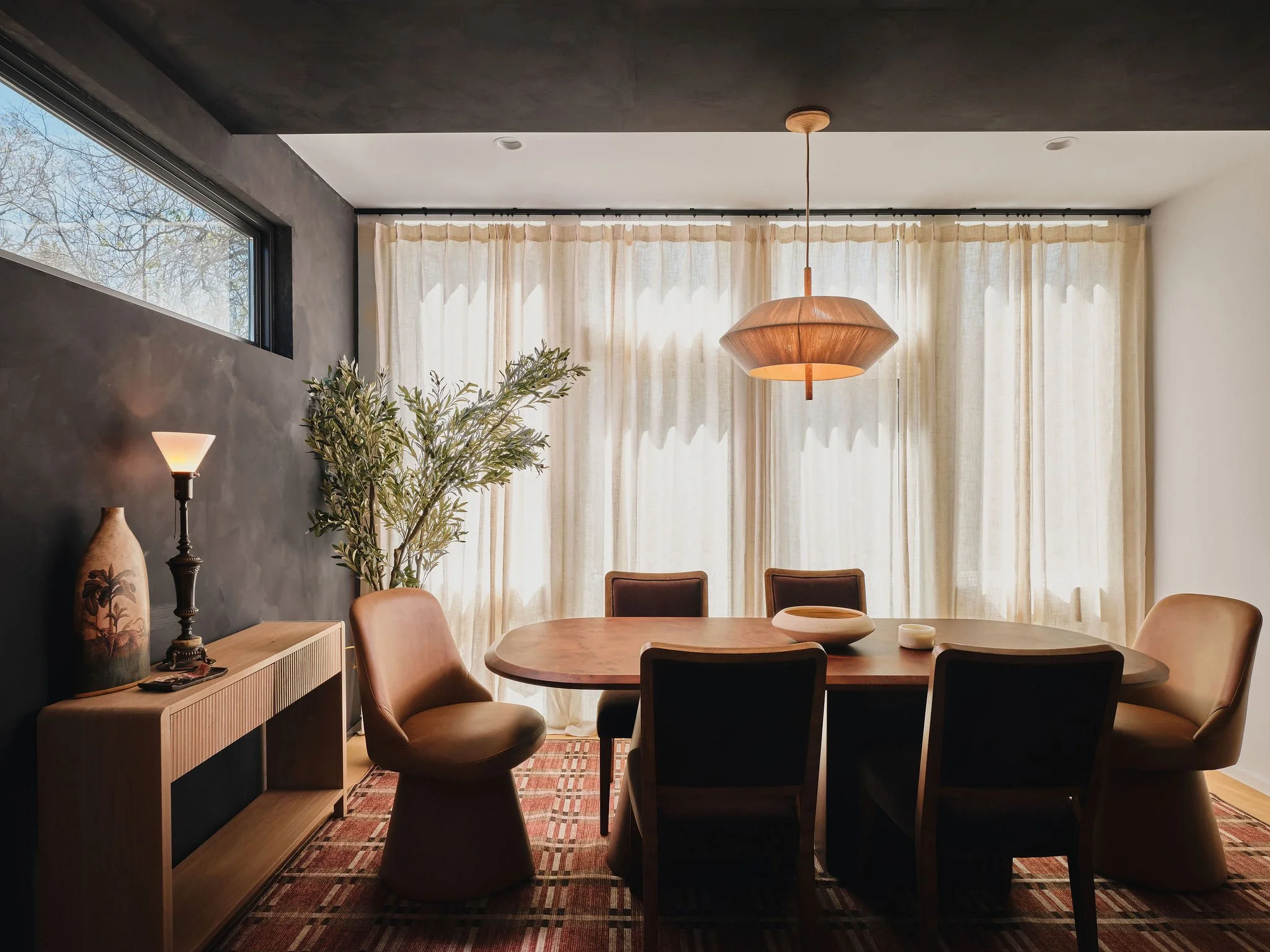
CV: The client needed serious convincing on the direction as a whole. They were initially stuck on the traditional 'white ceiling' rule… the idea of color drenching or wallpapering overhead felt completely foreign and risky to them. I had this conviction that we couldn't just play it safe. We used hyper-realistic renderings to bridge that gap, providing the visual proof they needed to move past their hesitation. Them embracing the black limewash and walnut built-in in the living room was the turning point. It all of the sudden became moody, textured, and finally captured that emotional 'weight' you felt in Italy. I’m so glad they followed our lead… that drama is now the undisputed star of the show.
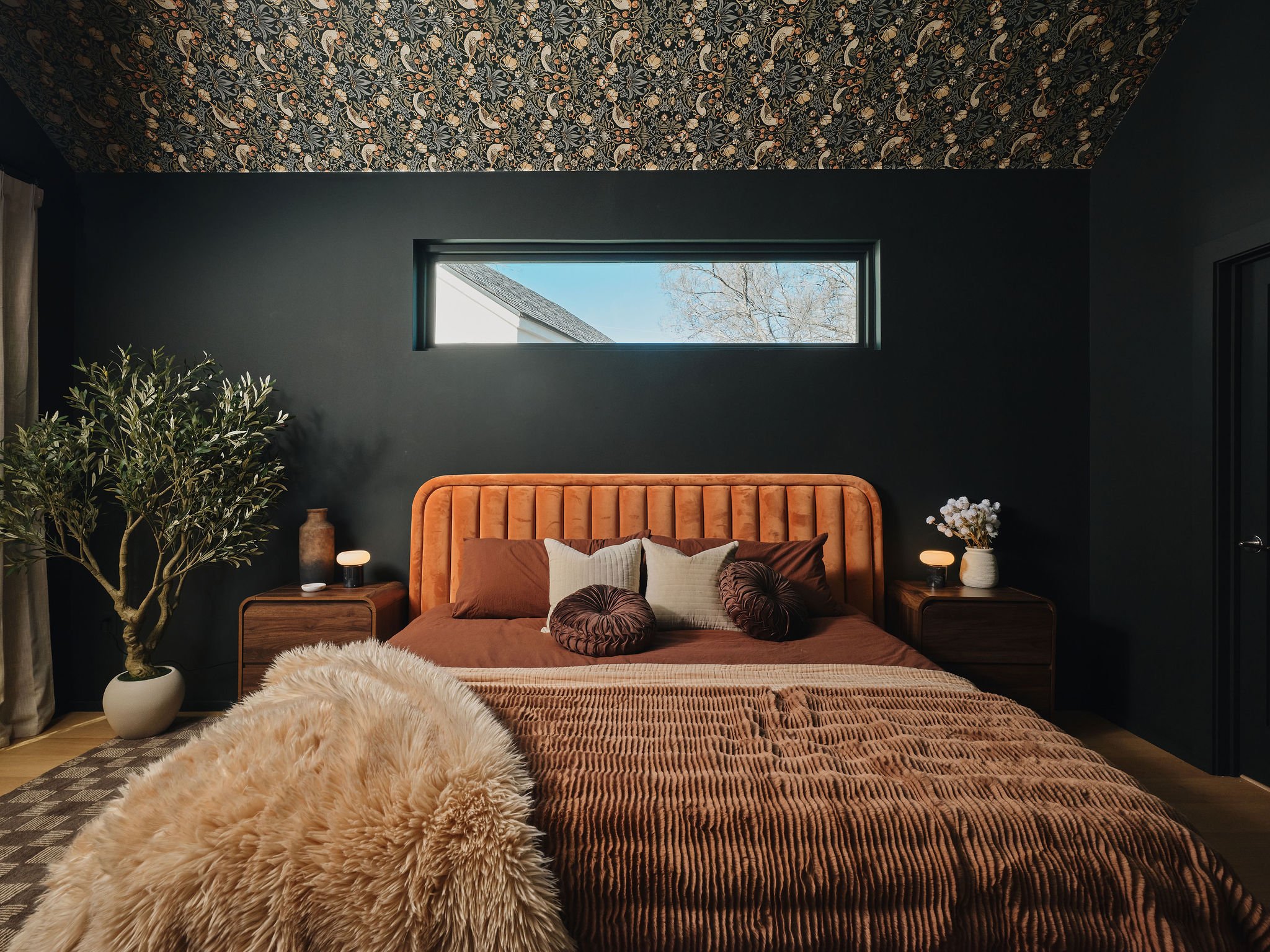
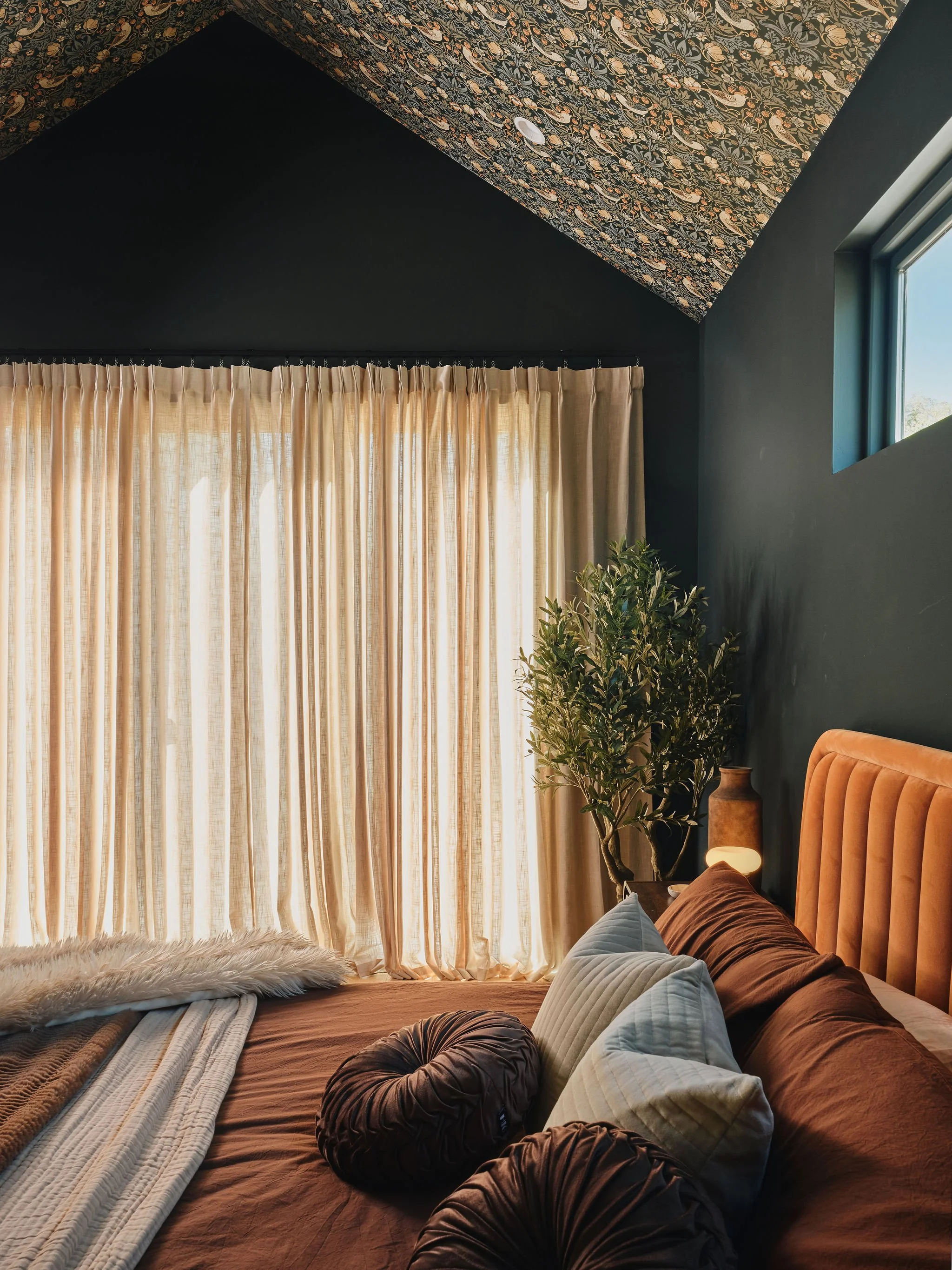
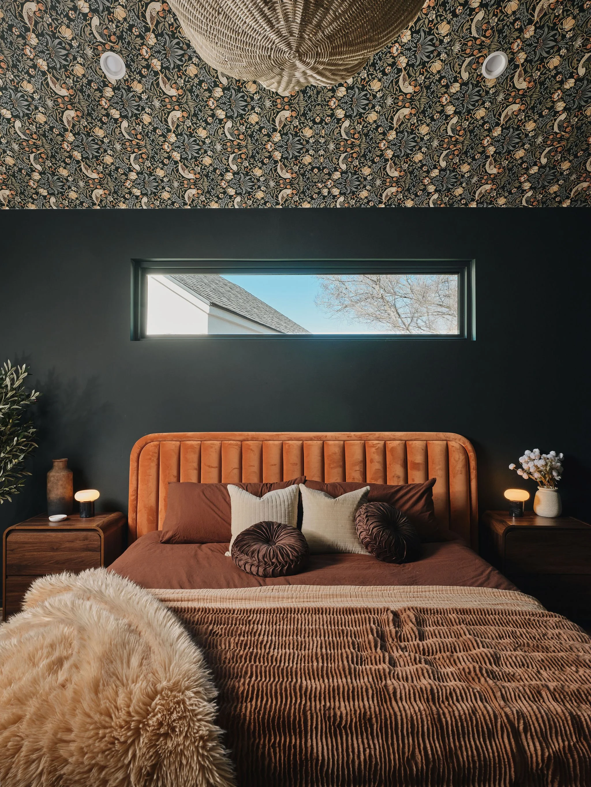
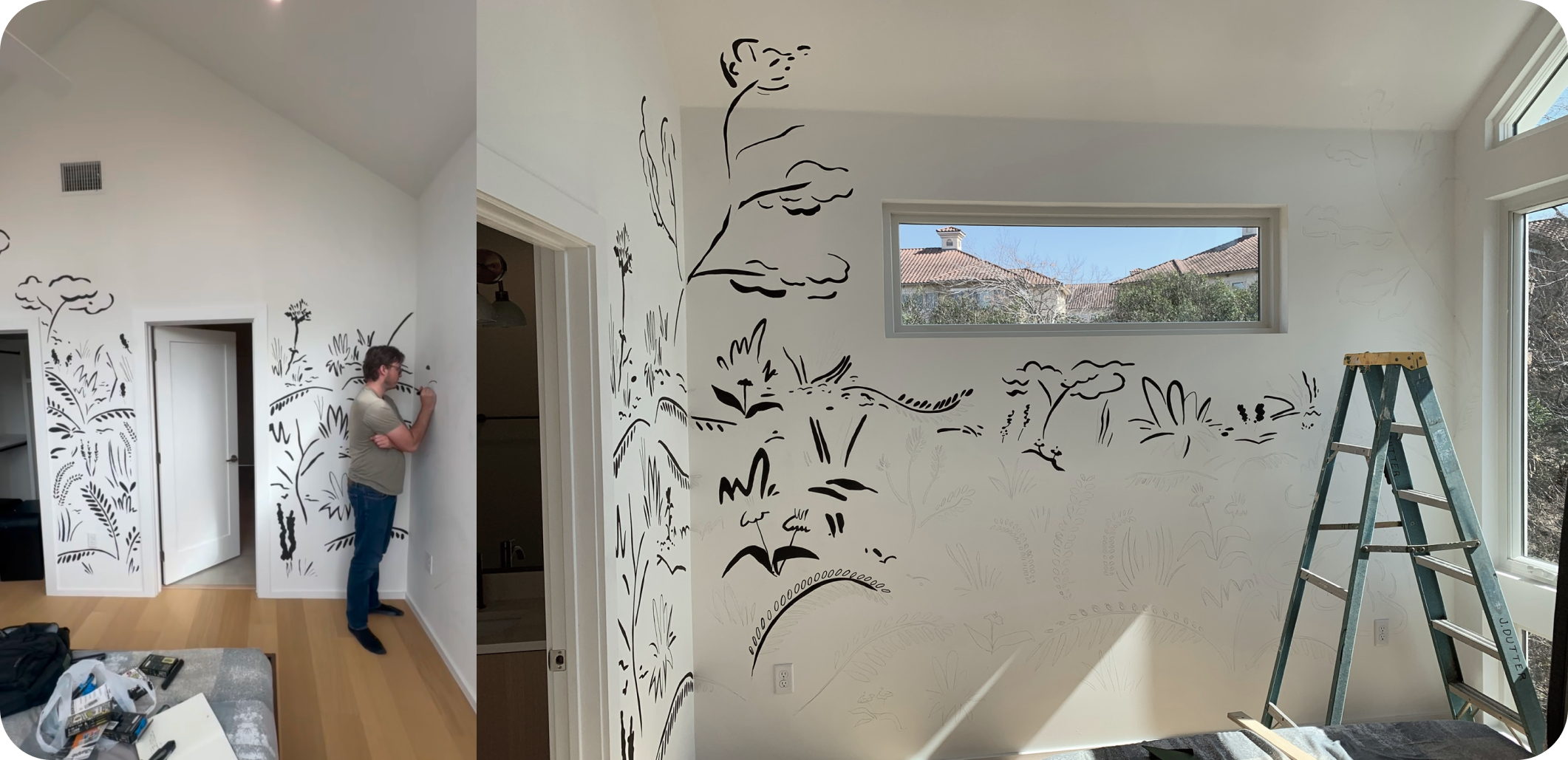
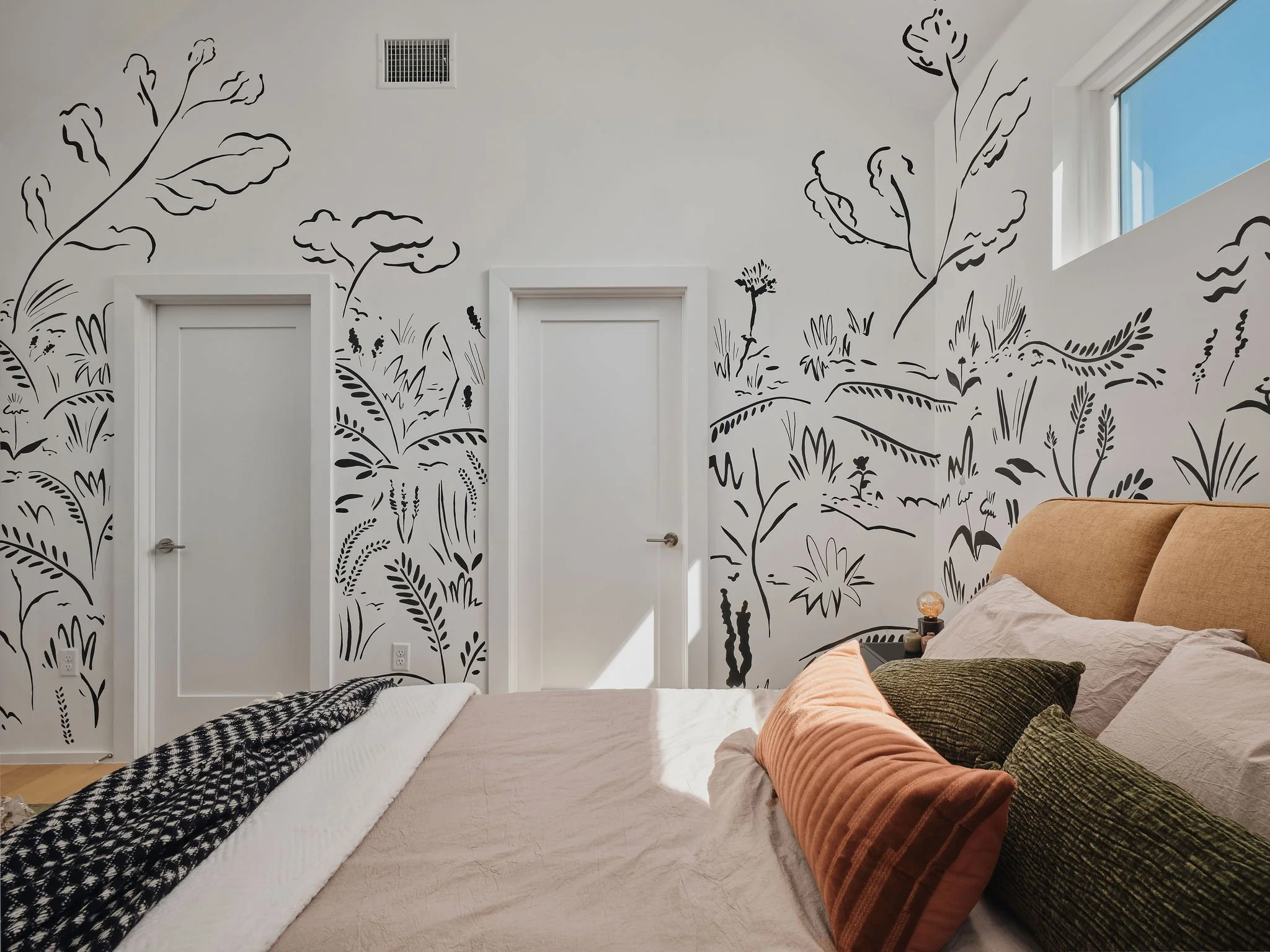
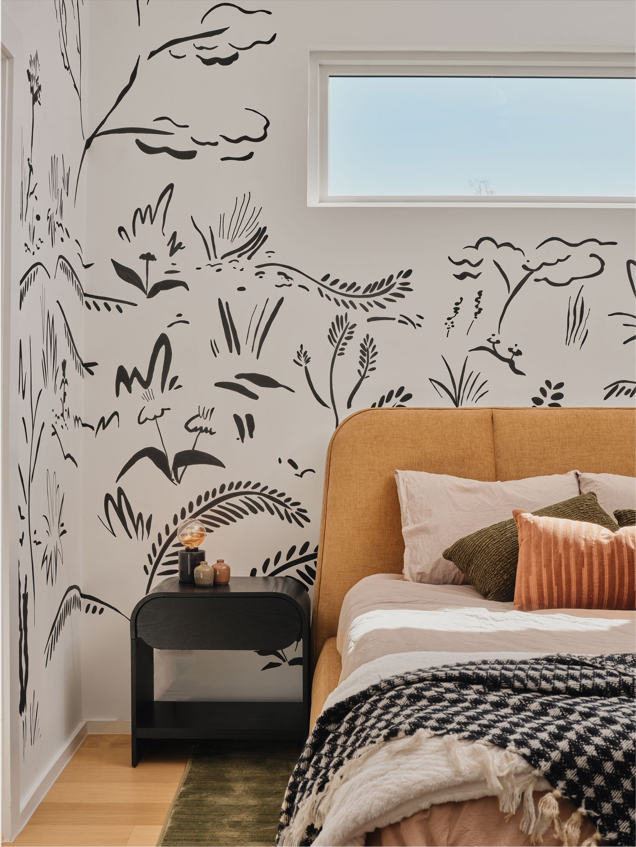
TS: What about the primary bedroom? That was a "tooth and nail" moment. I remember contending so hard for that leap of faith from the client to go with your vision to color drench the space and wallpaper the ceiling. And your instincts really paid off… It’s honestly magical. The room sitting right in the tree tops with the walkout deck, sporting the bird-and-leaf patterned wallpaper with the pendant light that looks like a bird’s nest… It’s so subtle, nuanced, and completely cohesive.
“I’m so glad the client followed our lead… the drama is now the undisputed star of the show.”
'“It all of the sudden became moody, textured, and finally captured that emotional 'weight' you felt in Italy.”
Turning a Design Flaw into a Focal Point
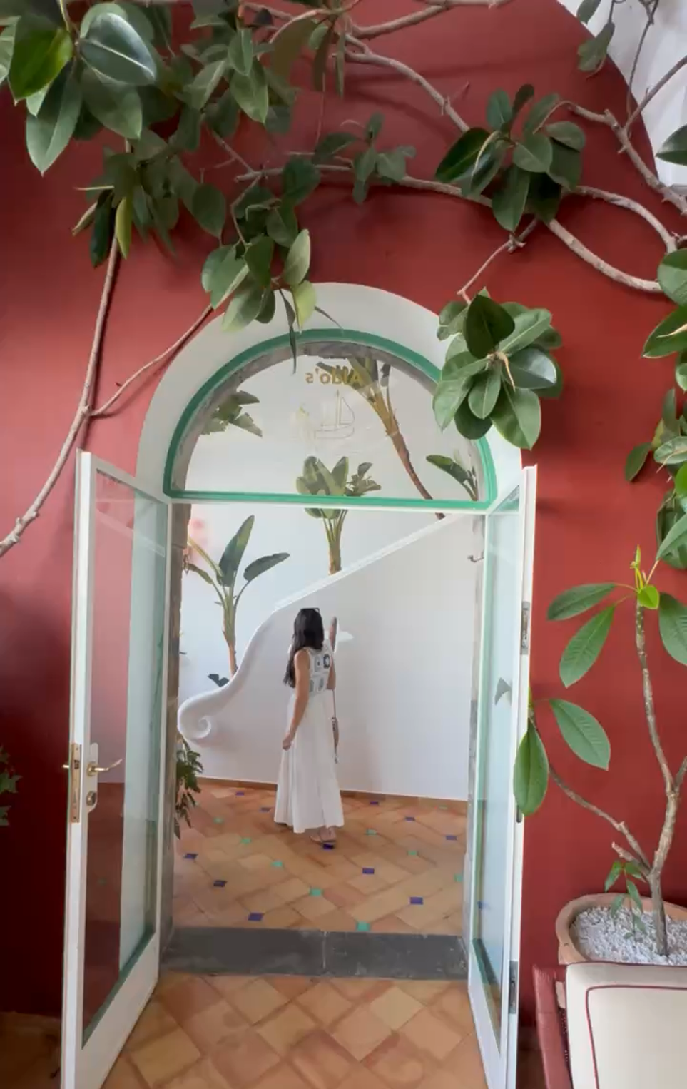
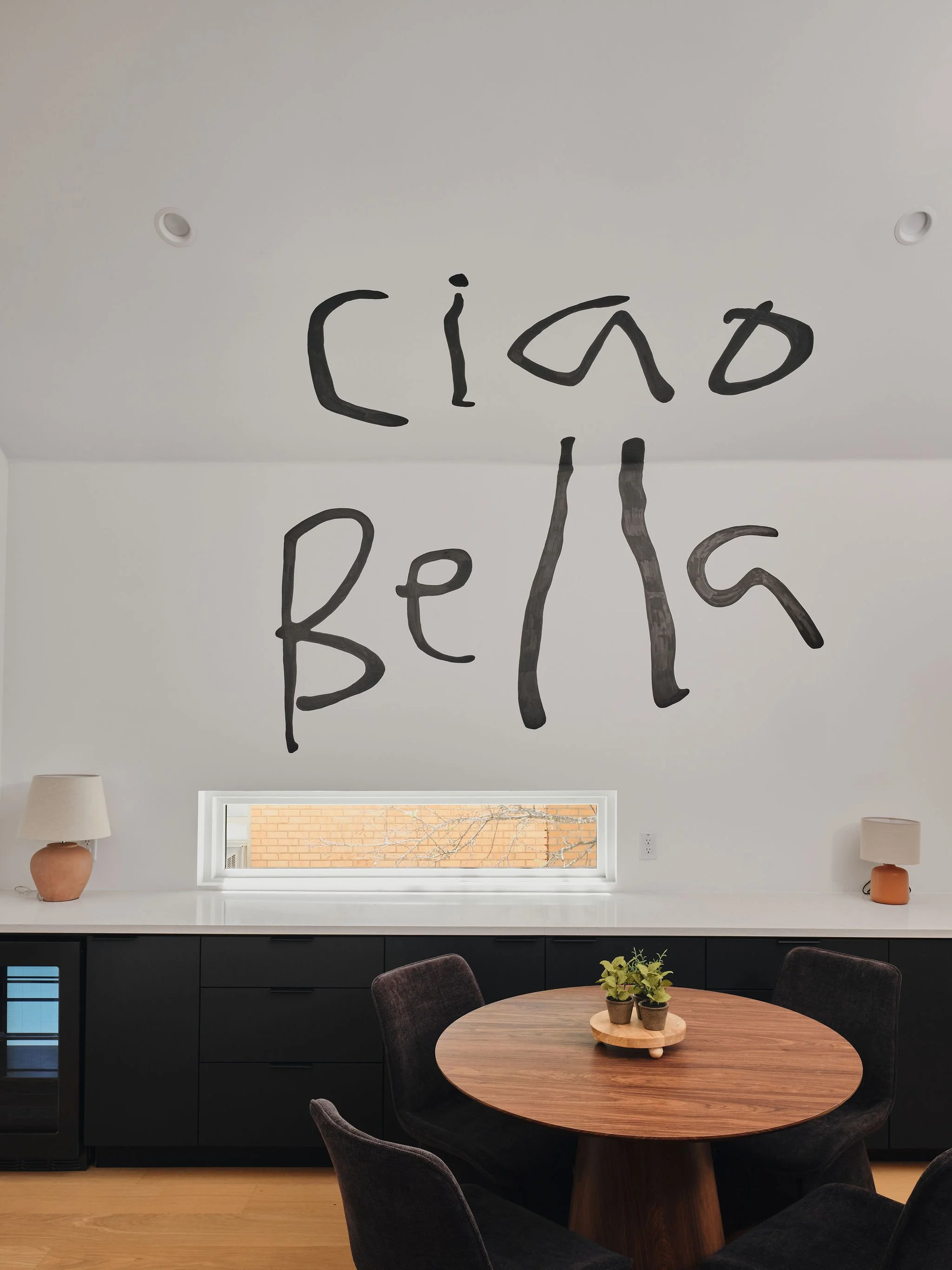
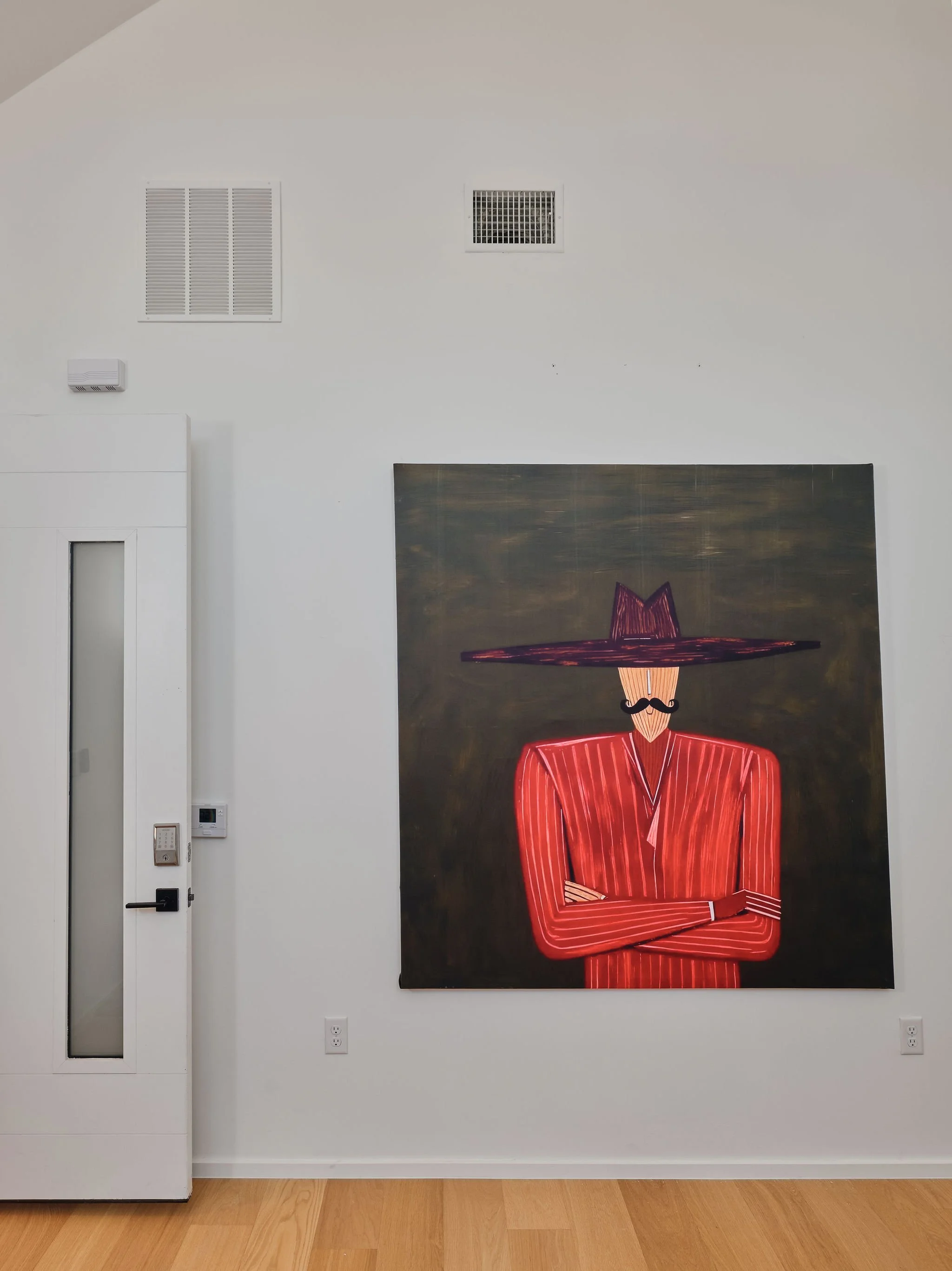
CV: That’s the "world-building" aspect that we always prioritize. Like in the mother-in-law suite, we didn't just hang basic art, we created a character and introduced him as this Italian debonair through a large-scale custom canvas that is accompanied with an adjacent "Ciao Bella" mural that seems as if he muttered it himself as you walk into the room. It makes you feel transported, like you’ve stepped into a story you’ve never experienced before.
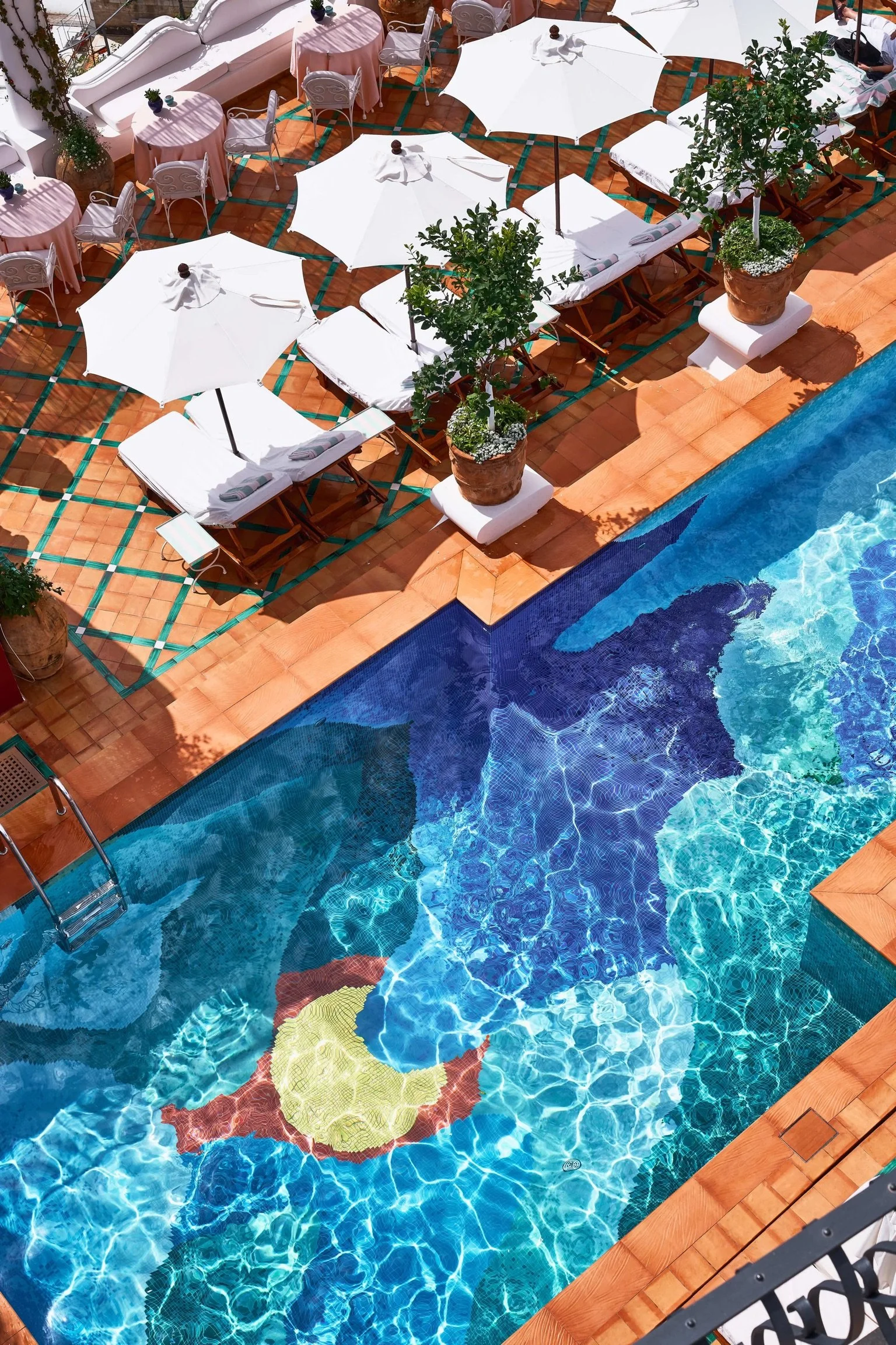
TS: It balances that adult sophistication with this sense of wonder. I mean, look at the backyard, the pool is obviously an incredible focal point, but I really wanted to introduce an elaborate mural that felt as chic and sophisticated as the inside while serving as an extension of the brand. I channeled my inner Banksy and did so many iterations before I landed on this leopard getting ready to pounce on a little mouse scurrying across the electrical cable. It represents a calculated calm and being at rest but remaining formidable. Which perfectly encapsulas the aura of the backyard. It’s a bit of rebellion. It’s fun. It’s for the kids, but it’s for the art lovers too.
CV: You went through so many iterations trying to figure out how to integrate the mural with that ugly AC unit, but it’s crazy that what we once considered an eye sore is now actually part of what makes it so cool and creative. Creating spaces for us has never been about getting inspired by a catalog, show room floor or Tik Tok design trends. It’s about the fact that no algorithm could design the feeling of that living room or the soul of the art. We set out to design a space that outlasts trends and makes people feel something and I can confidently say that we achieved that.
TS: In Italy beauty isn't extra, it's essential. And my hope is that every guest who stays at the Mount Vernon Estate has a similar epiphany to the one I did.
CV: Ciao, ciao.
